So its been a very long time since I started this project and started getting very "different" ideas compared to the typical narrative based ideas I usually get. This was more about finding visual styles and well, experimenting. I looked at work and artists I wouldn't usually look at and even used unconventional methods of animating and the entire thing genuinely felt like an experiment. The method I used for the final piece was very much like a scientist mixing chemicals and until the very end, it was an experiment to see what was animation.
I purposely chose to do this project in unknown territory, going back to the days of D&T in primary school and just the curiosity of a child playing with everything he/she sees. This feeling of being an alien in this unfamiliar world got me subconsciously thinking outside the box and coming up with what I believe were great ideas that I wish to pursue long after this project is over, when I can get the resources needed.
There is one thing i am slightly disappointed in though. The paint did not come out as vibrant as I would have liked, it was not my intention from the beginning to have to apply post effects to the piece in After Effects but because of the outcome of the paint, I was not left with much of a choice. The effect worked well but next time I would spend more time finding out the specifics of the paint and would have maybe just went all out and invested in the UV paint and a very powerful light source to help things along.
This success of this project was actually an outcome of a similar project I did during my 1st semester where I made a stop motion animation out of torn up newspaper articles and the unconventionality of these types of work has always amazed me. The pen and paper have been taken to a new dimension, but from that project I learnt that light was essential to pieces of work like this. The light needs to be consistent so sunlight is never a wise choice unless that is part of the work. The light changes through out the day so you get inconsistencies so that is why a room with no windows was the perfect location for this.
I've really enjoyed doing this project, the uncertainty of the outcome was a very new aspect to me. Its different from the storyboards and mood boards I would usually use. Its an effective and fun way to find and try out new techniques.
Sunday, 31 October 2010
Wooo....
As I did not get a chance to talk to my tutor about my concerns about the video being animation or not, I decided to email him and ask about it. he replied saying "either is fine- make your decision based on what looks most interesting and makes for a complete film" so I've decided to pick my newer one, but I do like both so maybe I could submit them both into festivals under different contexts or maybe under the theme of colour. But for this project I will be using the 2nd experiment as the finished pieces because its closer to what I wanted to create at the beginning.
Wednesday, 27 October 2010
Nooooo.....
So I was not able to to go into University today due to some family circumstances, so I did not get to show my experimental videos to the class or tutor to get some well needed feedback. So I showed it to a few people and due to the nature of the project and majority of the audience I was showing, it was quite hard to get feedback on the animation. What I got mostly was that it was nice, or it looks better than the old one. I received one useful comment though from a classmate by the name of Jason Darlow. He pointed out that for a majority of the video nothing major actually happened. The entire experiment seems to have finished within the first 10 seconds, so we were just left with 20 seconds of what could probably pass off as a still image so I decided to act upon this suggestion and made a 3rd version of my experimental. He added a positive comment though, He stated that it looks quite organic and I am glad this was taken from the experiment because I wanted it to relate to the human body in some way. maybe by the paint traveling through paths, like blood or the organic feel you get when the paint makes minimal movements.
Monday, 25 October 2010
Remix!!
After I had made progress on the 1st video, I showed it to some people but I got mixed responses but when I compared it to the brief and my initial idea i was also quite disappointed as I think it may have strayed too far away from the initial idea and slightly away from the brief as it didn't seem to follow a style, so i decided to experiment again and this was the result this time.
I personally prefer this result but on Tuesday I will try and show both to the class or the tutor to get some constructive feedback.
I personally prefer this result but on Tuesday I will try and show both to the class or the tutor to get some constructive feedback.
Sunday, 24 October 2010
The Process: The End...?
So I started the experiment and randomly pored the paint into the maze. I was not too bothered about the order the paint went in and wasn't bothered about my hand being visible in the either, but I did try and keep that to a minimum.
The outcome was not as I'd originally intended. The colours were not as vivid as I wanted and this was due to 2 things. the quality of my camera and the intensity of the light. My camera is not that impressive so it only did a mediocre job and the light just wasnt bright enough to make the paint as saturated as I'd have liked.
I tried to recover it in after effects but did not have much success, so I decided to continue on with it and experimented with the footage and the theme of Colour and the outcome was:
The Process: Camera
I needed a camera shot from the top of the lightbox and I could have used the camera stand the university had if I was confident that it could withstand the weight of the light-box and if I was confident it was long enough to give my camera a field of view big enough to consume the entire acrylic maze. This meant I had to make my own camera stand, so I placed my tripod on top of the lightbox but this didn’t allow me to tilt the camera downwards so I used another tripod in addition to this setup. I have a gorilla tripod which I wrapped around the main tripod to get the camera to face the right direction and then after that I was all about getting the angle and zoom right.
The Process: Protection
To protect the surface of the lightbox (as its the property of the University), and to create a texture underneath the acrylic, I bought some cling film from asda and laid it on top of the lightbox before placing down the acrylic maze. This made the paint very easy to handle and gave it a compound to travel inside of.
The acrylic was also applied for mine and other peoples health and safety. It made sure the paint did not cause some sort of malfunction inside the lightbox.
For the protection of others and my work, I left a very visible sign on top of my work before I went home to ensure no one came in contact with it.
The Process: Lights
For the light I needed underneath the acrylic, the best choice was to use the light boxes the University already had in their possession. I had also planned to use additional lights but they were not very effective. The only lights I needed were lights from underneath the acrylic, and the lightbox is the only light that could do that. I had another 500 watt light in the scene, but when i turned it on, it bounced off the walls and illuminated the entire scene and the light from the lightbox was not as visible anymore. I also noticed that the light from the lightbox was not travelling straight upwards, it was also wandering to the side, so I found something to put on the sides of the lightbox to prevent the light from escaping, and to just bounce the light back into the scene.
I also got an idea to introduce my own light rig. Because the light from the lightbox was relatively weak, I decided to bring in a 500 watt light and then reflect that off something unto my work but this did not go as planned. The light was far too bright and was not directional either. It went everywhere and bounced off the walls to completely illuminate the room and lessen the effect of the lightbox. I took the barn doors off of another light that was not working and tried applying this to the new light but this did not work out as planned either. The light leaked from the edges and the surface I was going to bounce the light off just wasn't effective enough so I stuck to the original plan.
The original plan was to use UV lights, but with UV lights, I could have placed them above the camera and the acrylic path. The problems of this are costs and also the placement of the lights. I have no previous experience with UV lights so I do not know how they were going to react with my camera or the acrylic and I didn't have the money or time to waste on a possibility so I looked into another alternative.
The Process: Paint
What I needed was paint that allowed light to travel through it, so that I could get vivid colours from the paint. So when I realised I may not be able to use the UV paint, i found the next best thing. oil paint. I liked patterns oil made and how it reacted with light, but when I got the paint, it was too thick to use. I went to consult a tutor in the printing department about possible ways to get the paint thinner and more transparent. He recommended that I use white spirit for 2 reasons. The first reason he recommended it was because it made the paint transparent but the second most important reason was because this meant the paint would "never" dry and this was perfect because it meant that I could wash my acrylic if i made a mistake or if I wanted to overlay different footage of the experiment, or do it over different days then I could have just used the same pieces of acrylic.
The Process: Making Way
So I went to get some pieces of acrylic to begin the project, and was about to cut out the path I had drawn out only to be told that I was not allowed to use the tool, so I had to figure out an alternative method for my project. There were 2 options: either make a completely different type of path or make a tower of acrylic paths and drop paint from the top so it travels through the tower, mixing as they go downwards. The tools I could use didn't let me cut grooves in the acrylic, so I had to cut paths all the way through the acrylic.
I made small chunks of acrylic with paths in them and then assembled them in a tower shape, but I could not see how the paint was going to drop down or how I was going to film it if it was like that but when I laid out the pieces into a maze type path, it was easy to see a method of filming it and the way the paint was going to travel and mix.
During the assembly of the maze, I tried stacking up the acrylic and realized the gave me a refraction and this is something I felt I could use, so i decided to stack up some pieces of acrylic on certain parts of the maze, but i soon realised that this effect only worked when it was viewed from an angle, so it did not show up on my recordings.
Friday, 15 October 2010
Getting ready...
Ok so some more progress with the experimental. Ive made a digital version of it in After Effects, mainly for the presentation on Tuesday, but it took a lot of experimenting. I got quite a lot of varying styles/effects whilst making it but this was the style I was satisfied with the most. Ive also attached some images unto this post which show the progress of the experiment.
1 Down!!!!
Yesterday I went for my induction at the University to enable me to use the machinery in the Design & Technology workshop. Whilst I was there I got talking to the technician and asked him about ways to get the acrylic, he mentioned an acrylics company that was situated on the A13. So on my way home I kept a look out for it and surely enough I spotted the company he was talking about.
So earlier today I went out to Barking Industrial park, in the UK near the A13 and after asking around and I managed to catch the owner of the company before he went home and begged him to give me some pieces of acrylic and luckily enough he was so kind to give them to me. I got 3 pieces of 10mm thick clear acrylic which were 26" X 9" (inches) and these are more than big enough. This will allow me to do my tests for the experiment.
Now I need to get the paint. I went to some car workshops and asked if the had UV paint but they gave me a long explanation of what UV paint is and basically said NO, so i am actually going to do some research into what UV paint is and see if i can just get the chemical cheap and then mix some colour pigments into it to give me the colour I want.....
Thursday, 14 October 2010
Lets try and save some time....
So in an effort to save some time and actually do something productive for this project I've decided to draw out the path/pattern that would be drilled into the acrylic and then i cleaned it up in Photoshop. for the sake of having something to show on Tuesday I will try and animate this in after effects so the class has an idea of what my project is and if i do not have the materials to make the project then I could always just go with a digital version of the animation.
The path is interesting because it looks like an abstract drawing of a human and as i said from earlier posts, his is almost like blood travelling through the body and giving life and this adds to that thought.
The path is interesting because it looks like an abstract drawing of a human and as i said from earlier posts, his is almost like blood travelling through the body and giving life and this adds to that thought.
Why Acrylic?
So on Tuesday morning as I was about to do my presentation i saw a clear piece of acrylic next to me and i saw that it had a groove in it. This made me think about trying to use acrylic because light will travel through it better than it would through something like wood and with more light = more colours and as my self proclaimed theme is "Colour" this was pretty much perfect. So now you know.
Busy Busy....Tired
So its been a whole but I'll summarise my progress so far; On Tuesday i was speaking to my tutor about the idea and he showed me to the workshop where I can cut the acrylic (ye...i changed the material i want to use) and also suggested that I used linseed oil with some pigments to give it the colour and the because of the pigments, the colours will still mix and change colour, so far so good. When i got home i tried to do some research into linseed oild but all i found was some youtube video, which didn't offer much. So i started thinking of possible alternatives and after asking around i came to the conclusion of using UV paint, so far so good? I did some research and spoke an advisor for paint and i found the right UV paint. Now for the problems. The university doesnt keep materials so if I want to use acrylic I'll have to buy it myself and same goes for the paint (the paint is not cheap). I will be going out to some factories tommorow on the A13 (motorway) asking for clear acrylic but for the paint, I'm still unsure about what to do. I may just get the Linseed oil and pigments and hope thats cheaper because with the UV paint, ill also have to buy UV lights but they are the preferred paint as they glow and if they were to seep into the cracks in the acrylic, this would create a wonderful effect. But ye thats all so far and if things don't start moving along very soon i may have to simplify this idea and just used water and paper instead or something to save time and money.
In this post I am going to include links to the website for the UV paint, Linseed oil youtube video and an image of the conversation i had with the UV paint advisor.
In this post I am going to include links to the website for the UV paint, Linseed oil youtube video and an image of the conversation i had with the UV paint advisor.
Tuesday, 12 October 2010
OOPPSS!!!
It seems like I've left out a video that inspired me for my second (and now main) idea. The video is what triggered the thought of paint and the "evolution" of paint as they interact. I am going to include the link to the advert it was made for and also a link to the "making of" video of it which i found very interesting to watch so take a look and Enjoy!!
Edit: I've tried asking what type of paint they used for this so that i could look into the paint and see if its suitable for my idea so fingers crossed that they reply.
Canon Pixma Sound Sculptures from Dentsu London on Vimeo.
And the Making Of
Canon Pixma: Bringing colour to life from Dentsu London on Vimeo.
Thursday, 7 October 2010
The "One piece" that is The Internet...
So through out my searches i found a wonderful site which as the name implies, has "Everything Visual" on there and i very much agree with this. There is a large amount of very interesting videos and images on this website. On this site I found a video that relates to my earlier idea about making projections unto the human body, but this made me realise that on top of needing the correct lighting conditions. I will also need a powerful projector, which is a resource i am not sure UEL has, but everything will be cleared up next Tuesday. But for now, heres the amazing Video by Marc Czerwiec & Vivien testard.
Enjoy!!
Light Rhapsody from MARC CZERWIEC on Vimeo.
We are two young french directors that decided to create a real time installation and make a video from it.
"Light Rhapsody" is a real time human lighting sculpture. A 3D model has been projected in real time over the real model through a projecting device. It creates a radiant dissemination emanating from her skin.That projection was animated and progress over her entire body until it has reached and invaded her face.
2 days shooting with the model (thanks to Julia for her patience!) and another one for the wild shot of NYC.
We shot with two cameras, a D90 and a 1Dmk4 cause the budget was super tight.
We would like to make some special thanks to our model, Julia Swell and our talented make up artist Cindy Leroux. Thanks to Hsiao-han Lan 筱涵 our magic set photographer !!!
Marc & Vivien
Oh my...More Lightbulbs!!
I just saw the “Bringing Colour to life” for Canon Advert by Dentsu London and I was blown away and also very inspired at the same time. I had a brainstorm of doing something with paint. I could engrave a path on a piece of wood and then pour paint into the path and film it as it travels and watch as the different coloured paint interact with each other and then to take the abstractness to another level I could later do Time-warps in after effects. The main problems I can foresee at the moment is that the paint may just get completely absorbed by the wood but this interaction might actually be a good thing. The infection of the wood is a very interesting concept and the paint can also be seen as blood giving life to wood. The piece can very well be interpreted as the wonders of life.
But 1 concern i have at the moment is whether this would be classified as animation. If that idea enough doesn't classify as animation which it most likely wouldn't then ill just try another method of executing it, which i am currently conjuring up on top of my squeaky chair, but this is something I will have to talk to my tutor on Tuesday.
OOH Lightbulbs everywhere...
So I had a lightbulb appear above my head and i kept it on long enough to plug it onto this post so here it is.
Have an object,(specifics unknown), and shape it into a Torus shape and in the middle of the torus is the camera and the projector. The projector is projecting the experimental video that’s been pre made unto the object, whilst the Taurus rotates and the camera is recording the outcome which is going to be experimental piece. This is also a good presentation method for the piece when it is being shown in festivals or exhibitions as it gives the piece a dimension that’s beyond its 2dimensional existence. But what makes this piece exceptionally interesting is the fact that it has gone from 2d, to 3d and has then ended up back as 2D, or maybe both dimensions depending on how it’s been exhibited.
Paper seems like a good choice for this as its very much associated with the 2nd dimension, because of drawing s and writings which are done on it but then this could also be said about the pencil or paintbrush. The main difference between these things is that the pencil and paintbrush have a very thick, compared to paper, 3 dimensional existence but paper is very thin object with an almost 2dimentional existence. I don’t really want to use paper as it’s linked too much to the exhibition method that Robert Seidel used for Chiral but then again my method is slightly different as the interpretation is slightly different and he is being credited as the inspiration of this piece.
If I was to use paper, I would most likely scrunch up the paper like he did and then use that as the torus. An interesting idea would also be to paint/draw unto the torus as it rotates around the projector. As this is a mixture of live action and stop motion animation, it may appear difficult to do, but I’ve seen this method accomplished before and what was done in that scenario is that 1 frame of the footage was played on the projector and then 1 frame of animation was done. This could very well result in some timing issues unless I do proper measurements but another method that is coming into my head is t fake he illusion. So I do the animation and then overlay the footage unto it in after effects to give the illusion that it’s been projected as that is what the overlay blend mode aims to achieve.
Robert Siedel...At last!!
So I fianlly ended up on his Vimeo page where he has 13 videos.I watched them all because I was completly fascinated. The mystery of the technique he used to achieve this and the explosion of colour just consumed me, it reminded me of an artist I researched during my time in Barking (I'll remember his name soonish).This gave my mind a new dimension of sight unto the project at hand. I had already stated I wanted to avoid doing computer generated effects for this so trying to figure out a way to achieve this kept my attention on his videos for a long time.
The main pieces of work that won my heart were Channel FIVE: Human paint, Futures- Zero 7 feat Jose Gonzalez, _grau, Appearing Disappearance and both Chiral Videos.
Each video had a different effect on effect on me, for example the Channel FIVE one matches what the brief states and showed me that 30 secs was enough time to create something thats visually beautiful and give the audience enough time to absorb what was going on.
Chiral however is the piece that left a mark and the appearance of this mark shall be revealed soon. I've always believed knowledge was just a bunch of questions and answers/ keys and locks and also the attempt to use keys that don't fit in some locks. But in this instance i thought to myself "What if I made something based on the Channel 5/grau/appearing disappearance and then projected it unto an object?"
I made a document of the thought process I was going through so here you go:
chiral | documentation projection & paper sculpture | MOCA Taipei 2010 from Robert Seidel on Vimeo.
Chiral | Projection & Paper sculpture | Taiwan/Germany 2010
Please check here for the Projection Artwork:
http://vimeo.com/14641476
Projection & Paper Sculpture: Robert Seidel
Soundtrack: Richard Eigner
Chirality is a scientific term describing a structure that is not identical to its mirror image. “Chiral” collects cinematic etudes, which develop various conceptual approaches in order to expand the two-dimensional image into space. They are projected onto a sculpture (510 x 260 x 370 cm) and a screen (250 x 200 cm) made from handmade Taiwanese paper and develop very different lives on these configurations of the same material.
The amalgamation of volumetric lights sets ideas from Chinese calligraphy into motion and melts them with influences from European Art Informel as well as impasto painting to an abstract-organic sculpture. The installation is completed by a soundtrack by Austrian composer Richard Eigner (www.ritornell.at). With the premiere in MOCA Taipei the first iteration of the long-term project was presented…
Premiered at Tripolar Exhibition - 3 Positions of German Video Art
Museum of Contemporary Art (Taipei, Taiwan)
Date June 15th 2010 - July 18th 2010
Supported by Council of Culture Affairs Taiwan, Taipei Culture Foundation, Goethe-Institute Taipei, Eden Book Store
Sponsored by Optoma, Transcend, Asus
More info
http://2minds.de/chiral.174.0.html
Images
http://www.flickr.com/photos/53551826@N06/sets/72157624731787591/
F L U X from candas sisman on Vimeo. Watch in Full screen HD.
by the courtesy of Plato Art Space (Plato College of higher education)
ilhan koman hulda festival, a journey into art and science exhibition
Ayvansaray Caddesi No:33 Balat - İstanbul
22 September - 31 october
video and sound design by Candas Sisman
commissioned by Plato Art Space
csismn.com
PlatoSanat.com
huldafestival.org
A Short Animation Inspired by the Works of İlhan Koman
Plato Art Space is proud to present Candaş Şişman’s video dedicated to famous sculptor İlhan Koman produced for the exhibition İlhan Koman: Hulda Festival, a Journey into Art and Science opening on the 22nd September, 2010.
İlhan Koman’s unique design approach in his form studies also inspires contemporary art works. The video installation Flux by young artist Candaş Şişman can be defined as a digital animation which is inspired from the structural features of some of İlhan Koman’s works like Pi, 3D Moebius, Whirlpool and To Infinity... A red circle, which is colored in reference to the red radiators of Ogre, is traced in a morphological transformation which re-interprets the formal approach of Koman’s works. The continuous movement sometimes connotes the formal characteristics of Pi, 3D Moebius, Whirlpool and To Infinity..., as well as the original formal interpretations of the design principles of the works . In Flux, Koman’s design process in the making of the Pi series has been treated as the emerging of a sphere from a two-dimensional circle by the principle of increasing the surface; and that simple direction is re-interpreted in digital medium. Thanks to this, in the digital animation an entirely different form serial that does not resemble Pi yet remaining its design principle can be followed through the flow of a circle to the sphere. As a conscious attitude of the artist, this work is not designed in a direct visual analogy with Koman’s works. During the animation, none of the moments of the transforming form look like Pi or 3D Moebius, however the subjective reading of Koman’s approach can be observed.
With the integration of the sounds of various materials – which Koman used in his sculptures – Flux turns into an impressive spatial experience. Flux, also exemplifies that Koman’s work can be re-interpreted by the analysis and manipulation of form in the digital medium.
The main pieces of work that won my heart were Channel FIVE: Human paint, Futures- Zero 7 feat Jose Gonzalez, _grau, Appearing Disappearance and both Chiral Videos.
Each video had a different effect on effect on me, for example the Channel FIVE one matches what the brief states and showed me that 30 secs was enough time to create something thats visually beautiful and give the audience enough time to absorb what was going on.
Chiral however is the piece that left a mark and the appearance of this mark shall be revealed soon. I've always believed knowledge was just a bunch of questions and answers/ keys and locks and also the attempt to use keys that don't fit in some locks. But in this instance i thought to myself "What if I made something based on the Channel 5/grau/appearing disappearance and then projected it unto an object?"
I made a document of the thought process I was going through so here you go:
A very good example that’s just come into mind would be the human body, but it wouldn’t just be that, I will start off with the “digital” piece from the main project and then when it gets to a certain frame, it is going to transition into the projection. The main problem is going to be about how I will get the projector and also the correct environment to give me the desired result. I will need a dark room and I plan to just have the projection define the human figure but I feel like I may need a fill light to help it along a bit.
This project will be like a huge homage to the Futures film also made by Robert Siedel, it is a main combination of futures and chiral but it’s been made to target the aspects of a human, especially life, death, beauty and ugliness.
I came across Flux , a film by Candas Sisman and it was such an amazing abstract piece of art to admire and it completely hypnotized me for the entire duration but although it is very impressive, I do not want to do a similar project. The reason for this is because it is entirely 3d and has most likely been made in C4D but my aim for this project was to try some new techniques and even though C4D counts as new software, it doesn’t come under the category for new techniques for me but the video has defiantly been an inspiration. It’s shown how the use of shapes and familiar objects.
I’ve just reread the brief and it seems like the animation only need to last 30 seconds and it’s classified as an animation in the title and recording a person projected upon does not really classify as animation. I can still do the original idea but I’m not completely sure of the amount of impact it would have in 30 seconds. I plan to make an enquiry into the length but it might very well end up that the length would be beneficial depending on the complexity of the technique I am going to have to use to achieve the effects I want.
A lot of the things that have inspired me so far have been digitally created or digitally edited but i do not particularly mind editing the footage but finding a suitable technique for what I’ve planned might take some time.
Chiral | Projection & Paper sculpture | Taiwan/Germany 2010
Please check here for the Projection Artwork:
http://vimeo.com/14641476
Projection & Paper Sculpture: Robert Seidel
Soundtrack: Richard Eigner
Chirality is a scientific term describing a structure that is not identical to its mirror image. “Chiral” collects cinematic etudes, which develop various conceptual approaches in order to expand the two-dimensional image into space. They are projected onto a sculpture (510 x 260 x 370 cm) and a screen (250 x 200 cm) made from handmade Taiwanese paper and develop very different lives on these configurations of the same material.
The amalgamation of volumetric lights sets ideas from Chinese calligraphy into motion and melts them with influences from European Art Informel as well as impasto painting to an abstract-organic sculpture. The installation is completed by a soundtrack by Austrian composer Richard Eigner (www.ritornell.at). With the premiere in MOCA Taipei the first iteration of the long-term project was presented…
Premiered at Tripolar Exhibition - 3 Positions of German Video Art
Museum of Contemporary Art (Taipei, Taiwan)
Date June 15th 2010 - July 18th 2010
Supported by Council of Culture Affairs Taiwan, Taipei Culture Foundation, Goethe-Institute Taipei, Eden Book Store
Sponsored by Optoma, Transcend, Asus
More info
http://2minds.de/chiral.174.0.html
Images
http://www.flickr.com/photos/53551826@N06/sets/72157624731787591/
by the courtesy of Plato Art Space (Plato College of higher education)
ilhan koman hulda festival, a journey into art and science exhibition
Ayvansaray Caddesi No:33 Balat - İstanbul
22 September - 31 october
video and sound design by Candas Sisman
commissioned by Plato Art Space
csismn.com
PlatoSanat.com
huldafestival.org
A Short Animation Inspired by the Works of İlhan Koman
Plato Art Space is proud to present Candaş Şişman’s video dedicated to famous sculptor İlhan Koman produced for the exhibition İlhan Koman: Hulda Festival, a Journey into Art and Science opening on the 22nd September, 2010.
İlhan Koman’s unique design approach in his form studies also inspires contemporary art works. The video installation Flux by young artist Candaş Şişman can be defined as a digital animation which is inspired from the structural features of some of İlhan Koman’s works like Pi, 3D Moebius, Whirlpool and To Infinity... A red circle, which is colored in reference to the red radiators of Ogre, is traced in a morphological transformation which re-interprets the formal approach of Koman’s works. The continuous movement sometimes connotes the formal characteristics of Pi, 3D Moebius, Whirlpool and To Infinity..., as well as the original formal interpretations of the design principles of the works . In Flux, Koman’s design process in the making of the Pi series has been treated as the emerging of a sphere from a two-dimensional circle by the principle of increasing the surface; and that simple direction is re-interpreted in digital medium. Thanks to this, in the digital animation an entirely different form serial that does not resemble Pi yet remaining its design principle can be followed through the flow of a circle to the sphere. As a conscious attitude of the artist, this work is not designed in a direct visual analogy with Koman’s works. During the animation, none of the moments of the transforming form look like Pi or 3D Moebius, however the subjective reading of Koman’s approach can be observed.
With the integration of the sounds of various materials – which Koman used in his sculptures – Flux turns into an impressive spatial experience. Flux, also exemplifies that Koman’s work can be re-interpreted by the analysis and manipulation of form in the digital medium.
At the end of a rainbow, you can find....
Colour. Thats what I found on my journey through the Internet (rainbow in this instance). It all started with Max Hattler, a Google search of his name led me to his Vimeo channel and from previous experience on Vimeo, I was sure to prepare myself for a roller coaster of inspiration. I looked through a lot of his work including striper v0.1 and his latest piece "Your Highness". maybe if I didn't read the video description for Your Highness I would have appreciated his work more but what I read just seemed stupid. to sum it up, he made the video with a meaning which i am unsure of but it was made without football in his mind-frame but when the film was interpreted as "an offbeat short film depicting masculinity, particularly on the soccer field" the artist seems to take full credit of this interpretation and as I stated in an earlier post, that really ticks me off so thumbs down to Max Hattler. You'll understand what I mean if you read the video description. Read the last one 1st and then read the top one last....Confused? read it again, S.l.o.w.e.r....
Anyways about this colour I found, it was actually through one of Maxs videos which he did with Robert Siedel. The video is titled "UIT VISUAL: Max Hattler + Robert Seidel" and ill be providing a link to it but inside this video I saw Drift by Max Hattler and _Grau by Robert Seidel. To build up the suspension about _grau, I'll waste your time a bit by telling you what I thought about Drift. The simplicity of this is what captured my interest and the analysis of the body with this simplicity just captured my attention. I feel like its showing the neutrality of the skin or maybe even the human form. Its innocence, a confession of the skin. Hope all that makes sense, I've started putting words together like these wacky artists, might have to go back to secondary school to learn some grammar.
Now for _grau (yes it seems like the underscore is part of the name....wierd) but this is the piece that changed my day and my outlook on the project. Robert says in the UIT visual Video, that this is based on the flashbacks you get before you encounter death. Kind of how people say your entire life flashes before you before you die, but what hes done is shown how we actually see memory. We can remember a lot of things in a very short amount of time and in the video you see how memory is fragmented and moves by slowly and also constantly breaks apart and turns into something else and i think this is an excellent visualization of how we perceive memory.
Wow i still haven't gotten to the colour part....my bad, I'll do it now.
I became interested in Robert Seidel and decided to visit his Vimeo page which is where i found.......COLOUR. See? Didn't have to wait that long....but sad to say, this has gone on a bit so I am going to dedicate the next post to Robert Seidel.
Drift (by Max Hattler) from Max Hattler on Vimeo.
"Drift considers the body as landscape through close-up images of skin. The music likewise takes a close-up view of a series of harp chords and viola harmonics. Using real photography in extreme close-up creates a foreign yet familiar world, removed from reality, yet sometimes almost too close. In the music, this tension is mirrored. Original samples are exploded into a multitude of tiny elements before being reconstructed into a tight arrangement based on the Fibonacci series." Specialten
Music by Mark Bowden
http://www.markbowden.net
Directed by Max Hattler
maxhattler.com
maxhattler.com/drift
© 2007
Wednesday, 6 October 2010
Stuart Hilton? Who's that?
Well, thats what wandered through my mind as I saw his name as a suggestion on the brief, I'm really one to remember names unless I'm going to get quizzed about it within the next 30 minutes but unfortunately Stuart Hilton is not a name i will remember for long but whilst i still do I'll tell you what i found out about him. I'm not going to tell you where he was born or how old he is because that has no relevance to anything so instead I will tell you about what he does to save you the Google search (Which doesn't give you much about him).
Stuart Hilton is an experimental animator and film maker and hes done works such Argument in a superstore, Dyers hall road, six weeks in June and save me. To be honest the only piece of worked I liked of his was Machine Word from 1988 which i found interesting because its always been a concept thats been playing around in my mind for a long time now. Sometimes when I've got my headphones plugged into my computer i can here the computer working and thats always felt like some sort of language and what hes done is hes shown that message in a visual form thats very similar to the binary system computers use.
If you feel you haven't learnt that much about Stuart Hilton from me, well neither have I, in fact I wasn't really interested. No offense to his work, just that the ones i saw, an example being Argument in a superstore, were not very appealing to me and only 1 in about 10 pieces of work interested me. Obviously he may have done plenty of amazing work, but chosen to keep it private, I am just speaking from what I saw, I'll also add the video of Machine Word from youtube below this post.
Project 1: 30 Second Experimental animation film.
Not the greatest fan of the experimental movies, especially not of the artists that try to make money out of something they accidentally stumbled upon and then try and put words together to confuse people into thinking it is a genuine piece of art. But then there are the experimental films that are done plainly to for aesthetic purposes, just to please the eyes and these are the sorts I like. I'm not saying I don't like every piece of experimental or abstract film/animation that is not aesthetically pleasing, I'm just saying i do not like artists that "lie/mislead" people about the purpose of their work. Anyways back to the project, the brief has several Dos and Don'ts. These are:
Don'ts:
No music
No Characters
No Dialogue, no narrative voice-over (snippets of voices are allowed)
No traditional narrative/ plot
Dos:
- 'Narrative' should be focused on an object, environment, atmosphere
- Graphic approach: consider image composition, colour, patterns, textures, atmosphere
- Typography is allowed as long as it doesn't tell a 'Story', but by no means compulsory
- Experiment! Push yourself to try new techniques + approaches
And ye if you didn't get bored reading all that, thats pretty much all the rules i need to follow and through out today I've been doing some research into what other artists have done and ill be posting all these up in a bit.
Don'ts:
No music
No Characters
No Dialogue, no narrative voice-over (snippets of voices are allowed)
No traditional narrative/ plot
Dos:
- 'Narrative' should be focused on an object, environment, atmosphere
- Graphic approach: consider image composition, colour, patterns, textures, atmosphere
- Typography is allowed as long as it doesn't tell a 'Story', but by no means compulsory
- Sound! Crate your own sound design / soundscape using software by richly layering field recordings. sound effects libraries, sound files from sounddogs.com, etc
- Build up the film organically, create sound, image and 'narrative' at the same time, through editing, trial and error, rather than predefined storyboard- Experiment! Push yourself to try new techniques + approaches
And ye if you didn't get bored reading all that, thats pretty much all the rules i need to follow and through out today I've been doing some research into what other artists have done and ill be posting all these up in a bit.
Ok so its a New Start and I'm Inspired...
Well i haven't touched this Blog in about a year but I am now in University (UEL Docklands Campus) and its a different experience. The students are very serious, (something thats been missing for a while) and I feel that I can learn a lot from here, but anyways I am not here to brag about the university.
This is going to be a diary of my inspirations. No matter how minimal it is, I will try and share it and i will also be sharing my progress through my professional career and hope that by this time next year I am writing on here from an in-house animation studio somewhere in Soho but thats in the future and I'll always try to talk about the "Nows" until that happens!!
This is going to be a diary of my inspirations. No matter how minimal it is, I will try and share it and i will also be sharing my progress through my professional career and hope that by this time next year I am writing on here from an in-house animation studio somewhere in Soho but thats in the future and I'll always try to talk about the "Nows" until that happens!!
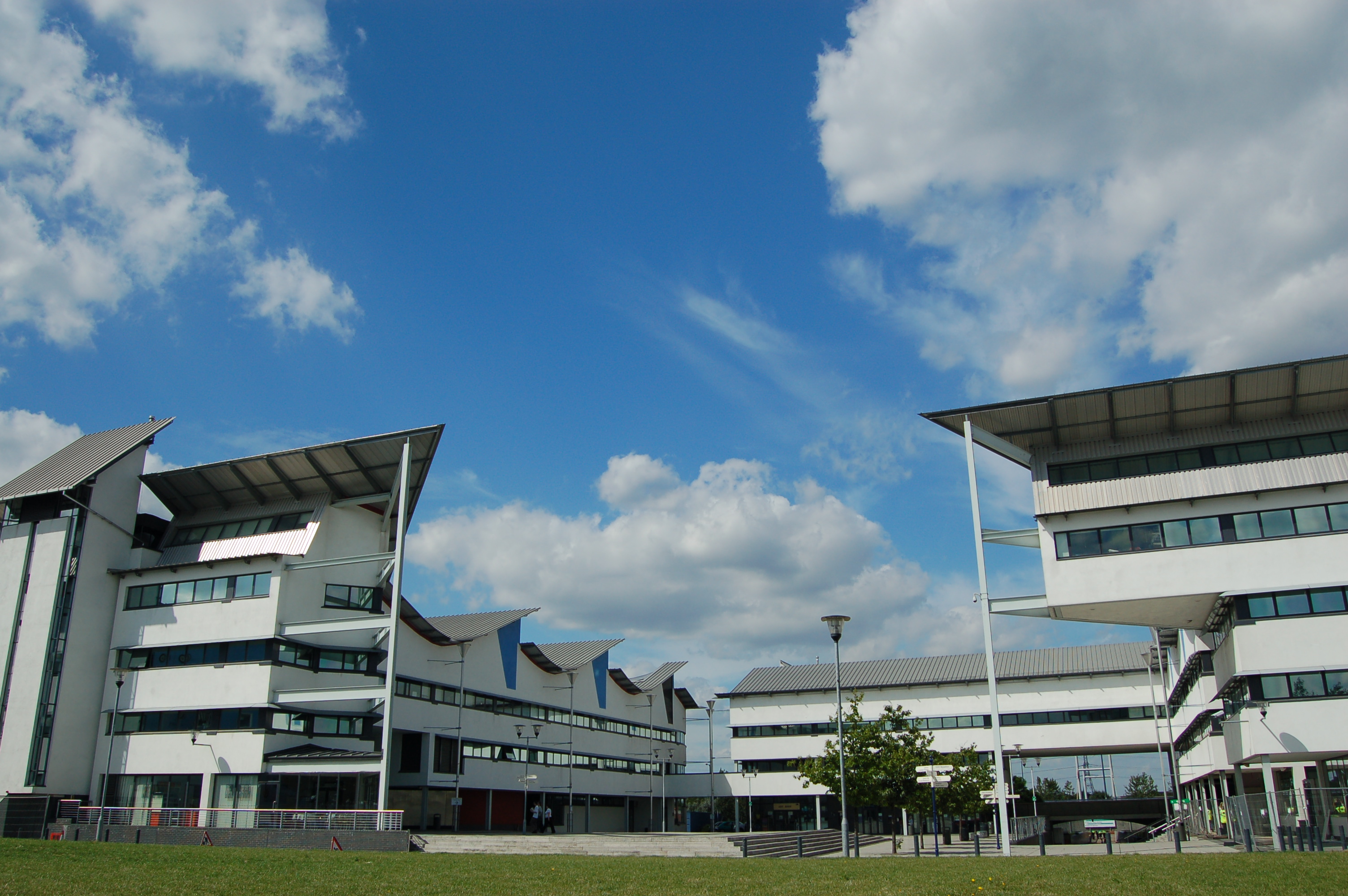 |
| An image of the UEL Docklands campus taken from Wikipedia, but I will try and get my own images on here once I get my camera. |
Subscribe to:
Comments (Atom)